Portfolio

Car Sharing/Carpooling App

Business Project | UI/UX | Landing Page | SEO Conversion

Cruze was my first project at my present workplace, Creative Motion. It was a technical challenge to demonstrate my ability to integrate solid UI/UX principles while also designing a very SEO friendly Landing Page. The wave pattern was used to separate sections, enforcing the carefree feeling of the Cruze brand.

Just go together

Cruze's goal is straightforward: to make a difference. This goal can be met through building resilient infrastructure, promoting inclusive and sustainable modes of transportation, and encouraging innovation.

Colour Palette

Turquoise Blue
#05F2F2

American Purple
#3A1B59

Royal Pink
#E5369D

Davy's Grey
#545454

Type

Cruze

Typeface: Akzidenz

Ride Together

Typeface: DDH Story Brush

Partners

Typeface: Helvetica

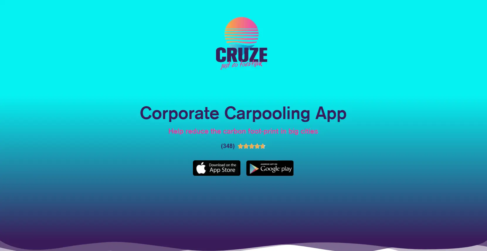
Cruze's carefree attitude and calming mantra are established by employing a gradient background made of Turquoise Blue and American Purple. The user is given a sense of comfort by blending them with Royal Pink. As a result, the brand identity is given a "Miami Vice"-like attitude.

The majority of the typography is done in Akzidenz, with DDH Story Brush being utilized only for the tagline. Alternatively, all of the text descriptions are written in the Helvetica typeface, which is both reliable and simple to read.

Wireframe

Get in Touch